PYTHON
Welcome to sulfure dioxide air pollution!
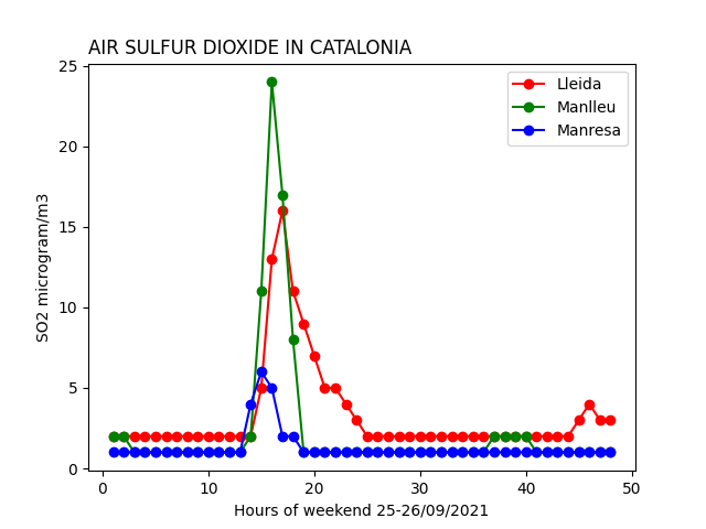
Cumbrevieja is a volcano located in la Palma island. It's an active volcano producing sulfur dioxide gases in the atmosphere.
The weekend 25 to 26 of September 2021 air pollution from the volcano arrive to Catalonia as you can see in the following graph.
The graph was created using matplotlib library using python and the code is below.
Data is obtained from the air polution website of Generalitat de Catalunya.
  import matplotlib.pyplot as plt

x = [1,2,3,4,5,6,7,8,9,10,11,12,13,14,15,16,17,18,19,20,21,22,23,24,25,26,27,28,29,30,31,32,33,34,35,36,37,38,39,40,41,42,43,44,45,46,47,48]
  # x data is 48 hours data obtained from Generalitat data base corresponding to SO2 in the weekend of interest.
y = [ [2,2,2,2,2,2,2,2,2,2,2,2,2,2,5,13,16,11,9,7,5,5,4,3,2,2,2,2,2,2,2,2,2,2,2,2,2,2,2,2,2,2,2,2,3,4,3,3],
      [2,2,1,1,1,1,1,1,1,1,1,1,1,2,11,24,17,8,1,1,1,1,1,1,1,1,1,1,1,1,1,1,1,1,1,1,2,2,2,2,1,1,1,1,1,1,1,1],
      [1,1,1,1,1,1,1,1,1,1,1,1,1,4,6,5,2,2,1,1,1,1,1,1,1,1,1,1,1,1,1,1,1,1,1,1,1,1,1,1,1,1,1,1,1,1,1,1] ]
      # y data are SO2 levels hour by hour in the 3 citiesindicated in labels

labels=['Lleida', 'Manlleu', 'Manresa']
colors=['r','g','b']
  # colors of the 3 cities are r=red, g=green, b=blue

# loop over data, labels and colors
for i in range(len(y)):
    plt.plot(x,y[i],'o-',color=colors[i],label=labels[i])
plt.title("AIR SULFUR DIOXIDE IN CATALONIA", loc='left')
plt.xlabel("Hours of weekend 25-26/09/2021")
plt.ylabel("SO2 microgram/m3")
plt.legend()
plt.show()